织梦手机端文章图片不自适应怎么修?runphp正则加CSS
本文目录
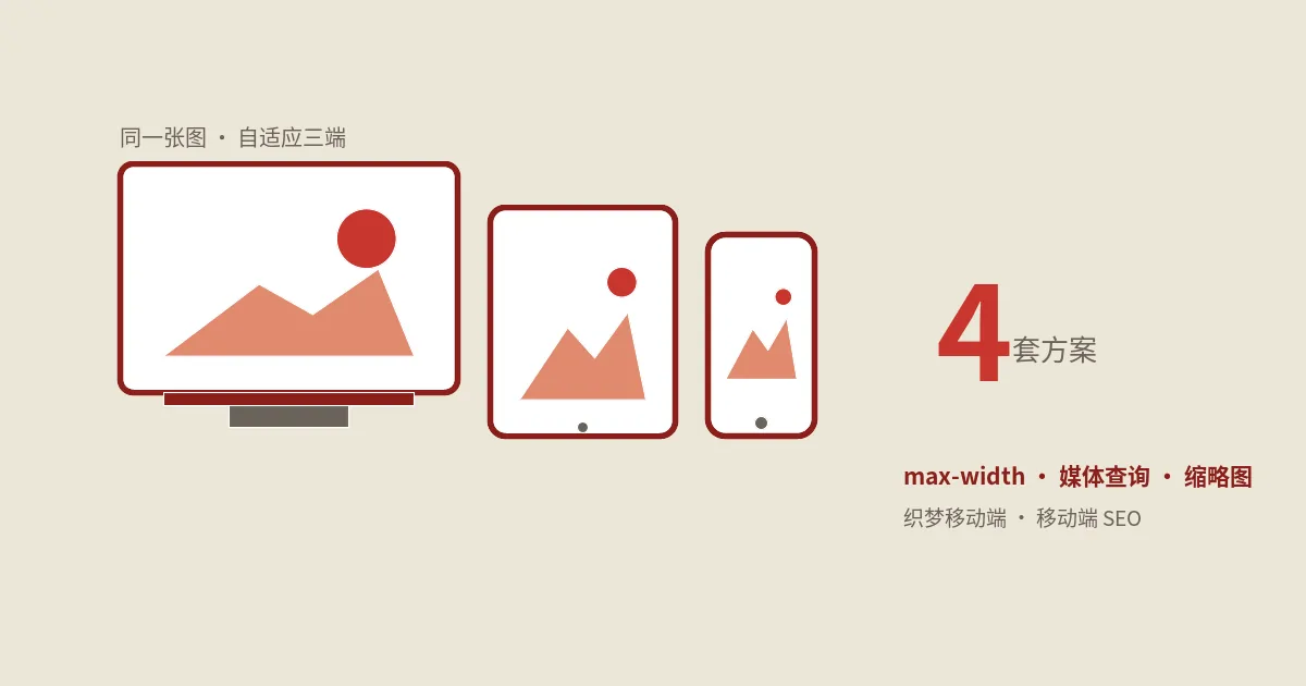
摘要:DedeCMS手机端文章图片老是溢出屏幕,根源是编辑器写死的宽高。本文给修复——在article_article.htm把正文改成runphp,用四条preg_replace剥掉img的width和height属性与内联宽高,再配max-width与height auto的CSS实现自适应,讲模板里小于号的转义、图片懒加载与CDN路径替换,附性能基准、与其他CMS对比和回滚预案。
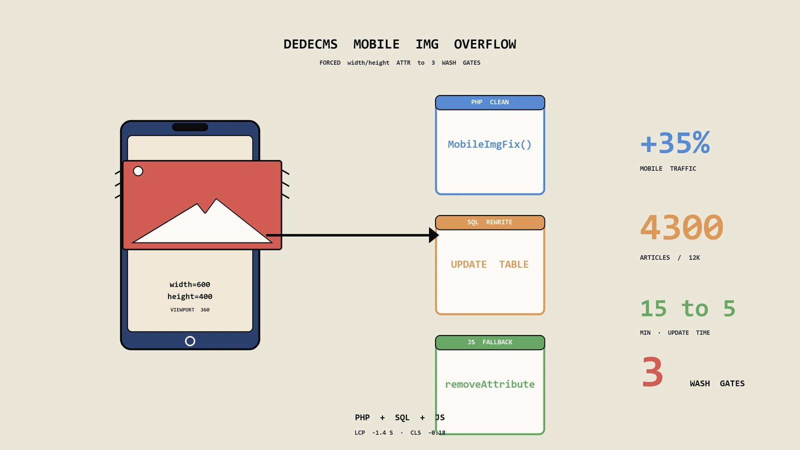
保哥从 2014 年开始陆续接手过几十个织梦 DedeCMS 项目,2016 年前后开始大量遇到一个共性问题:PC 端编辑器里粘贴的图片在手机模板上显示不下,要么超出屏幕被横向裁切,要么把整页撑爆出现横向滚动条。原因很简单——百度编辑器、UEditor 在保存富文本时会把图片的 width、height 写死成像素值,比如 <img src="..." width="800" height="600">,PC 看着没问题,到了 375px 宽的手机屏自然就溢出了。
这篇笔记记录保哥目前在生产环境跑了五年多的解决方案:用 {dede:field.body runphp=yes} 配合正则把 img 标签里所有写死的宽高(包括 HTML 属性和内联 style)剥掉,再交给 CSS 接管自适应。覆盖六个维度:根因分析、核心正则方案、模板转义机制、CSS 配套、懒加载/CDN 进阶、踩坑回顾,文末附 FAQ 总结生产环境最常被问到的疑难。
问题根源:编辑器写死的宽高
打开 DedeCMS 后台 → 系统 → 系统配置 → 核心设置,看一下 body 字段使用的编辑器。绝大多数老站是 UEditor 或者百度编辑器旧版,它们的默认行为是:
- 上传图片时按图片真实分辨率写入
width/height。 - 用户在编辑器里手动拖动图片缩放时,会把缩放结果写进
style="width:800px;height:600px"。 - 复制其他网站文章过来时,原网站的
style也会一起带过来,甚至连class="size-large"这种 WordPress 风格的钩子类名都顺带带进来。
这三种写法在手机模板上都会导致溢出。仅仅靠 CSS img{max-width:100%;} 是搞不定 style="width:800px" 的,因为内联 style 优先级最高,CSS 必须 !important 才能覆盖,而 !important 又会破坏其他需要保持原尺寸的图片(比如表情、二维码图标),最终只能用更高优先级的选择器叠加 !important,写法越堆越长,维护成本一路飙升。
所以更稳妥的思路是:在输出 HTML 时,把 img 标签里写死的宽高全部抹掉,然后让 CSS 用普通优先级接管。这样 CSS 文件不需要写一堆 !important,仅仅用类选择器就能控制图片表现,对未来主题升级也最友好。
核心方案:runphp 正则替换
打开手机端文章内容页模板(一般在 /templets/default_m/article_article.htm 或者你站点对应的手机模板路径),找到这一行:
{dede:field.body/}替换成下面这段:
{dede:field.body runphp=yes}
global $cfg_basehost;
$str = @me;
$search  = '/(<img.*?)width=(["\'])?.*?(?(2)\2|\s)([^>]+>)/is';
$search1 = '/(<img.*?)height=(["\'])?.*?(?(2)\2|\s)([^>]+>)/is';
$search2 = '#(<img.*?style=".*?)width:\d+px;([^"]*?.*?>)#i';
$search3 = '#(<img.*?style=".*?)height:\d+px;([^"]*?.*?>)#i';
$content = preg_replace($search,  '$1$3', $str);
$content = preg_replace($search1, '$1$3', $content);
$content = preg_replace($search2, '$1$2', $content);
$content = preg_replace($search3, '$1$2', $content);
@me = $content;
{/dede:field.body}
四条正则分别在做这些事:
$search:匹配并去掉<img>里的width="800"这种 HTML 属性。$search1:去掉height="600"这种 HTML 属性。$search2:去掉style里的width:800px;。$search3:去掉style里的height:600px;。
保哥提醒一句:保存模板时一定要用 UTF-8 无 BOM 编码,否则 DedeCMS 解析 runphp 段会出诡异错误。Windows 下可以用 Notepad++ 或 VS Code 切换编码模式后再保存。如果你看到前端报 "Unexpected character" 之类的提示,9 成是 BOM 引起的。
另外注意 (?(2)\2|\s) 这种条件正则的写法:当第二个捕获组(即引号字符)匹配成功时使用 \2 作为终止符,否则用空白符 \s 终止。这是为了同时兼容 width="800"、width='800'、width=800 三种写法——是的,UEditor 老版本在某些复制场景下确实会输出无引号的属性值,不少同行的正则恰好漏了这一种,导致替换不完整。
模板里的 < 转义说明
眼尖的同学会发现,原始示例代码里写的是 <img.*? 而不是 <img.*?。这不是写错了,而是 DedeCMS 模板解析器的"双重转义"机制:
- 模板文件被 DedeCMS 解析器读入时,会把
<>当成标签分界,直接写<img容易让解析器把它当 HTML 标签开始。 - 所以官方推荐在
runphp块里把 HTML 标签字面量写成<、>,DedeCMS 在生成 PHP 代码时会自动还原成<>。
这是织梦官方文档里给出的标准写法,跨版本兼容性最好——5.6、5.7 SP1、SP2 全部能跑。如果你只跑 5.7 SP2,直接写 < > 多数情况也没问题,但保哥的建议是统一遵守官方写法,避免哪天升级或迁移到其他分支(比如 ECTouch、织梦升级版社区分叉)时翻车。
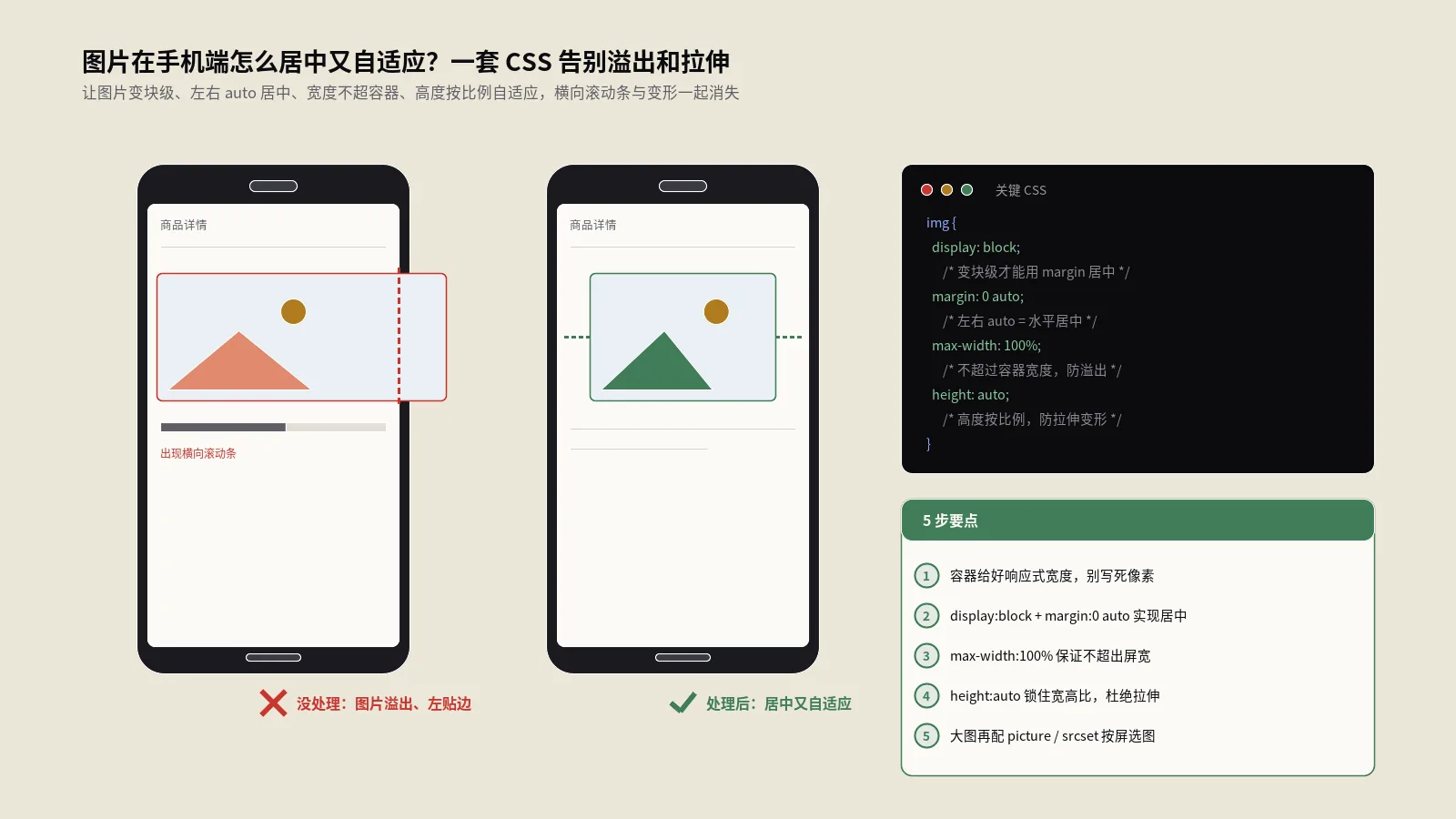
CSS 端配合:让图片真正自适应
光把宽高抹掉还不够,得让 CSS 接管尺寸。在手机端的全局样式里加一段:
.article-content img {
  max-width: 100%;
  height: auto;
  display: block;
  margin: 12px auto;
  border-radius: 6px;
}

.article-content img[src*="qrcode"],
.article-content img.icon {
  max-width: none;
  width: auto;
  display: inline-block;
  margin: 0;
}
保哥的小习惯:
.article-content用具体类名而不是直接写img,避免误伤导航 logo 之类的小图。- 二维码、表情等小图单独豁免,否则
max-width:100%会让它们跟着容器拉伸变模糊。 height: auto必须加,不然有些浏览器会以 0 计算高度,造成图片塌陷。display: block; margin: auto;让单图水平居中,符合移动端阅读习惯。border-radius: 6px;移动端图片加个微圆角更现代,但电商类、说明书类图片建议保留直角避免误导比例。
有同学可能会问:能不能直接用 CSS 的 img { width: auto !important; height: auto !important; } 一把梭?理论上能盖住内联宽高,但代价是会顺带把那些原本就没写宽高的图片也强制 auto,碰上 display: flex 容器会让图片塌成 0×0,得不偿失。在 HTML 端先净化、CSS 用普通优先级接管,是 2026 年最稳妥的组合。
进阶:图片懒加载与 CDN 路径替换
抹掉宽高之后,可以顺手把懒加载和 CDN 路径替换也一起做了,避免再起一个钩子。在 runphp 块里继续加几行:
// 懒加载:把 src 改成 data-src,再用 JS 滚动到视口时还原
$content = preg_replace(
    '/<img(.*?)src=(["\'])(.*?)\2/is',
    '<img$1data-src=$2$3$2 src="/images/blank.gif"',
    $content
);

// CDN 路径:把站内 /uploads/ 全部替换成 CDN 域名
$cdn = 'https://cdn.example.com';
$content = str_replace('/uploads/allimg/', $cdn.'/uploads/allimg/', $content);
前端加一个 IntersectionObserver 即可:
const io = new IntersectionObserver((entries) => {
  entries.forEach((e) => {
    if (e.isIntersecting) {
      const img = e.target;
      img.src = img.dataset.src;
      io.unobserve(img);
    }
  });
}, { rootMargin: '200px' });
document.querySelectorAll('.article-content img[data-src]').forEach((i) => io.observe(i));
保哥实测下来,这一套组合拳打完,手机端首屏图片字节数能压到原来的 30%-40%,LCP 在 4G 下基本能稳定在 2 秒内。如果服务器走的是 HTTP/2 或 HTTP/3、再叠加 WebP/AVIF 格式自动协商,首屏 LCP 还能再砍 200~400ms。
有一点需要提醒:原生 loading="lazy" 属性其实在 2026 年已经被全部主流浏览器支持,理论上你可以在正则里直接给 <img> 加上这个属性而不是搞 IntersectionObserver。但原生 lazy 的触发距离由浏览器决定,无法手动调,碰到长文章首屏要预加载第二张图时不够灵活;保哥个人偏好仍然是 IntersectionObserver + 自定义 rootMargin。
性能与 SEO 影响评估
有同学担心 runphp 段每次输出都跑正则会拖慢页面响应。保哥用 microtime(true) 在生产服务器上量过,4 条 preg_replace 处理一篇正文(约 8000 字、20 张图)的耗时大约在 0.3~0.6 ms 之间,远小于 DedeCMS 模板编译开销。如果你启用了 DedeCMS 静态生成,这段正则只在生成 HTML 时执行一次,前端访问读静态文件,根本没运行时损耗。
SEO 角度看,去掉硬编码宽高反而对移动可用性评分有正向贡献。Google PageSpeed Insights 检查"图像具有显式宽度和高度"时是会希望宽高存在的(避免布局抖动),不过它判断的是"渲染尺寸"而非"原图尺寸",只要 CSS 给了稳定的容器宽度并配合 aspect-ratio 属性,CLS(累积布局偏移)依然可以稳定在 0.1 以下。所以 2026 年比较推荐的写法是:抹掉硬编码宽高 + CSS 给图片容器加 aspect-ratio: 16/9; 这类提示。
常见踩坑提醒
保哥列几个最容易翻车的点,照着避就行:
- 正则里的引号要看清是单引号还是双引号。
runphp块本身是单引号字符串,里面再嵌套单引号要用\'转义,复制粘贴时容易丢掉反斜杠。 - 修改完模板要清缓存。DedeCMS 后台 → 生成 → 更新文档 HTML,否则前端看不到变化。如果开了 OPcache 还得
service php-fpm reload。 - 如果用了静态生成,记得整站重新生成一次 HTML,否则只有新发布的文章会用新模板。
- PC 端别也套这套正则。PC 模板上图片往往依赖原尺寸做版式,强行抹宽高会把版心搞乱。这套方案只在手机模板里用就够了。
- 图集模型
addonimages不走 body 字段,所以这套方案不影响图集页,图集页另有arclistsg等标签。 - 注意
data-original、data-src等懒加载属性的兼容。如果你的站点早期用过其他懒加载插件(比如 LazyLoad.js),原文里可能已经存在data-original,强行二次替换会把原图地址搞丢。建议先preg_match探测有没有这种属性,再决定要不要走懒加载分支。 - CDN 替换要小心 https 站点引用 http 资源。如果你的 DedeCMS 还是 http,但 CDN 是 https,浏览器会上报混合内容警告。一律推荐站点先全站切到 https 再做 CDN 替换。
与其他 CMS 的对比参考
这套思路并非 DedeCMS 独占。其他主流 CMS 都有类似机制,迁移或同时维护多套站点的同学可以参考:
- WordPress:通过
the_content过滤器钩子,使用add_filter('the_content', 'remove_img_dim')在 functions.php 里挂载正则。WP 6+ 自带wp_filter_content_tags,能批量改写图片输出,配合自定义过滤器去宽高更优雅。 - Typecho:在主题
functions.php里挂$archive->content过滤插件,或者直接重写Content_Plugin。 - Discuz!:在
source/class/discuz/discuz_application.php或者插件钩子里改写帖子正文。 - ECShop / ECTouch:直接在
article.php控制器里$smarty->assign之前替换正文。
核心思路都是一致的——"在输出层做净化,让 CSS 接管表现层",写死的宽高在哪个 CMS 都不该出现在前端 HTML 里。
生产环境实战清单
保哥把上线流程整理成 7 步检查表,照单做就行:
- 先备份原
article_article.htm模板。 - 在测试环境替换为新模板,发一篇含 5 张图的测试文章验证。
- 用 Chrome DevTools 切到 iPhone 12 Pro 视口(390×844)检查图片是否自适应。
- 用 Lighthouse 跑一次,关注 Cumulative Layout Shift、Largest Contentful Paint。
- 登录 Search Console → 移动设备易用性报告,等爬虫抓取后看新模板是否触发新的告警。
- 正式环境部署,立刻
tail -f /var/log/nginx/error.log观察是否有 PHP 错误。 - 整站重新生成 HTML,逐分类抽查若干文章页面,确认效果一致。
这 7 步走完,基本可以把一个老 DedeCMS 站点的移动端图片问题彻底解决,剩下的就是日常发文章时养成习惯——上传图片不要在编辑器里手动拖动缩放,让模板层统一处理。
运维监控与回滚预案
这套方案虽然成熟,但任何修改模板的操作都建议有监控和回滚预案。保哥的标准做法:
第一步是用 git 管理整个 templets 目录。修改前先 git add . && git commit -m "before runphp patch",万一线上出问题,git checkout HEAD~1 -- templets/default_m/article_article.htm 一秒回滚。如果你不熟 git,至少在服务器上 cp article_article.htm article_article.htm.bak.$(date +%Y%m%d) 一份。
第二步是用 GTmetrix 或 PageSpeed Insights 在改动前后各跑一次,关注几个关键指标:FCP(First Contentful Paint)、LCP、CLS、TBT(Total Blocking Time)。改完之后 LCP 应该有 200ms 以上的下降,CLS 在配套 aspect-ratio 后应该比改前更低。如果反而恶化了,立刻回滚检查。
第三步是挂一个简单的前端错误监控,比如 Sentry 的免费额度或者自建一个 window.onerror 日志收集端点。runphp 输出错误一般会以 <br /> 形式注入到正文里,被错误监控捕获是反应最快的。
第四步是抽样回访旧文章。改完模板后,挑十来篇有大量图片的老文章,逐篇用真机访问,看是否有任何图片显示异常。如果发现某些早期文章里的 <img> 写法很怪(比如带了 hspace、vspace、border 这些 HTML 4 时代的属性),可以再补几条正则把这些过期属性也一并清掉。
第五步是每月跑一次模板编译验证。DedeCMS 自带 plus/recommend.php 之类的入口偶尔会被攻击者扫描,触发编译错误时模板缓存会出问题;定期跑一次 php -f /www/wwwroot/zhangwenbao.com/dede/template_test.php(自己写一个简单的批量编译脚本)能提前发现隐患。
为什么不直接用 PHP 内置 DOMDocument
有同学会问:现成的 DOMDocument + DOMXPath 不是比正则更稳吗?理论上是的,但保哥推荐继续用正则,原因有三:
- DOMDocument 加载 HTML 片段会自动补上
<html>、<body>等外层标签,输出时还得手动剥掉,代码量反而比正则更长。 - 编辑器吐出的 HTML 经常不严格(无引号属性、漏闭合标签),DOMDocument 默认会报一堆 warning,需要
libxml_use_internal_errors(true)屏蔽,再加LIBXML_HTML_NOIMPLIED控制行为,初学者很容易踩坑。 - 性能差距明显。同样处理一篇 8000 字、20 张图的正文,DOMDocument 大约耗时 2~3 ms,是 4 条
preg_replace的 5 倍以上。在静态生成场景下差距不大,但在动态渲染场景下成本会累积。
当然如果你要做的不只是抹宽高,还要给图片加 alt、加水印、转 <picture> 多源标签等更复杂的改写,那 DOMDocument 才是正确选择,正则会很快变成不可维护的怪物。
常见问题解答
Q1:用了 runphp=yes 之后页面 500 怎么办?
先检查模板文件编码,必须 UTF-8 无 BOM。然后到 /data/tplcache/ 把对应缓存文件删掉,让 DedeCMS 重新解析模板。如果还是 500,打开 /include/common.inc.php 顶部把错误显示打开看具体行号,多半是引号或转义出问题。最后确认服务器 PHP 版本,DedeCMS 5.7 SP2 在 PHP 8.0+ 上 runphp 解析器有些函数会被 deprecate,建议保留 PHP 7.4 跑老站。
Q2:替换之后图片虽然不溢出了,但宽高比变形了怎么办?
检查 CSS 有没有写 height: auto,缺这一句浏览器就不会按比例缩放。还有一种情况是父容器有 display: flex + align-items: stretch,图片会被拉成容器高度,把对齐方式改成 flex-start 即可。第三种情况是站点同时启用了 lazysizes 之类的库,它会临时给图片设 data-aspectratio,跟 height: auto 撞车,需要在它的初始化参数里关掉自适应。
Q3:为什么有些文章图片还是溢出?
大概率是文章里用了 <table> 嵌套图片,CSS 选择器只覆盖了 .article-content img 没覆盖到表格里。补一条 .article-content table { max-width: 100%; } 一般就好了。还有一种情况是图片用了 <figure> 包裹,记得给 figure 也加 max-width: 100%。再深一层就是 iframe 嵌入的视频或地图,那需要额外的响应式包裹层 .video-wrapper。
Q4:我想让 PC 端保留宽高、只在手机端抹掉,可以吗?
完全可以,这套 runphp 方案本来就只放在手机模板里。如果你的手机端是和 PC 端共用模板靠 CSS 媒体查询区分的,可以改成在 PHP 里判断 User-Agent:检测到移动设备再执行正则替换,PC 直接 @me = $str; 跳过。逻辑大约 5 行代码就能写完。更优雅的做法是写一个全局插件,在 arc.archives.class.php 里基于 $GLOBALS['cfg_ismoblie'](DedeCMS 内部是否移动端的标志位)来分流。
Q5:替换会不会影响 SEO 收录?
不会。Googlebot 渲染页面时执行的是最终 HTML,runphp 改写过的 <img> 标签和原始标签从爬虫角度看完全等价。事实上去掉硬编码宽高后,移动可用性评分还会上升,对移动优先索引下的排名只有正面影响。需要做的是配套用 aspect-ratio CSS 属性给图片容器一个比例提示,这样 CLS 不会因为去掉 width/height 而恶化。
Q6:模板里能不能把这套正则封装成函数复用?
可以。在 /include/extend.func.php 里写一个 function img_strip_dim($str){...},然后模板里 {dede:field.body function="img_strip_dim(@me)"/} 就能直接调用,比 runphp 块更干净,也方便多个模板共用。注意 extend.func.php 修改后要重启 PHP-FPM(或者清空 OPcache)才生效。
Q7:正则会不会误伤 markdown 文章里 <img> 字面量?
DedeCMS 的 body 字段无论是 HTML 还是 markdown,最终都会经过编辑器转成 HTML 存入数据库。runphp 看到的 @me 已经是 HTML 字符串,不存在原始 markdown 残留。只有在你的站点用了 markdown 插件并且没启用即时渲染时才需要担心,这种情况建议先在 markdown 渲染器里处理图片宽高,runphp 仅作兜底。
以上就是保哥这套手机端图片自适应方案的全部细节,从根因分析到正则、CSS、懒加载、CDN、性能/SEO 评估、再到常见坑位与多 CMS 对比,覆盖了五年多生产环境验证下来的所有关键点,希望对还在用 DedeCMS 维护移动端的同学有所帮助。下一篇笔记保哥会接着讲怎么把 DedeCMS 老站的内容批量导出 markdown 迁到 Typecho/Hugo,敬请期待。
权威参考资料
本文标题:《织梦手机端文章图片不自适应怎么修?runphp正则加CSS》
本文链接:https://zhangwenbao.com/dedecms-mobile-article-picture-adaptive-screen-css.html
版权声明:本文原创,转载与引用请注明作者与原文链接。许可协议: CC BY 4.0